Forget the complexity: AI all boils down to drawing the right lines

Despite the best efforts of humans, the most effective AI systems come down to one simple idea: finding the best-fitting line for a set of data points.
Now there’s a whole book’s worth of subtlety there:
- the real name for a “line” is actually “function”
- these “lines” can exist in many dimensions
- finding exactly the right “line” can be tricky
But over and over again, the field of AI keeps coming back to this single, powerful idea: give computers lots of data and ask them to find the right lines.
LLMs, prediction models, embeddings, image recognition models — fundamentally, they all come down eventually to this.
Let’s go line hunting!
Line hunting
I have imposed upon an LLM to make me a data table of heterosexual romantic relationships between characters in sitcoms. Accuracy here is not assured!
| Sitcom | Man | Man's Age | Woman | Woman's Age |
|---|---|---|---|---|
| Friends | Ross Geller | 29 | Rachel Green | 28 |
| Friends | Chandler Bing | 31 | Monica Geller | 30 |
| The Office (US) | Jim Halpert | 28 | Pam Beesly | 27 |
| Parks and Recreation | Ben Wyatt | 35 | Leslie Knope | 35 |
| Parks and Recreation | Andy Dwyer | 29 | April Ludgate | 24 |
And plotted, this looks like:
📊 There's meant to be a graph here. Click refresh if you don't see it.
Let’s draw some lines on this chart!
We can start by assuming the perfect age of a female romantic partner for a man (of any age) is 37, which — coincidentally — is the age of my wife, who’s reading this.
A line that shows this perfect age (37) on our graph would show that whatever age a man is, the woman’s age should be 37. We’ve plotted men’s ages on the X axis, and we want to show the Y axis at 37, so we want to draw the line y = 37:
📊 There's meant to be a graph here. Click refresh if you don't see it.
It’s a beautiful line for sure, but it also appears to lack any predictive power over reality (well, TV shows) with just a quick visual inspection. Our line does not fit the data points!
OK, let’s try something new. Since at least the 1800s there’s been a suggestion that “half [the man’s] age + 7” might work (y = 0.5x + 7). Let’s plot it…
📊 There's meant to be a graph here. Click refresh if you don't see it.
Well, this is also clearly still not quite right. But is it any better than what we had before? It’s angled, which is a good start, and it passes through a few points, but so did our horizontal line. So, what does better mean?
What is better?
As a human, it’s clear to us that these lines don’t accurately describe the data — we have a “ground truth” in terms of what the data looks like — and the lines we have don’t seem to represent a very good fit for it. As we complained about before, they lack “predictive power”.
Let’s say we want the computer to draw us a better line; we’re going to need a better metric for determining if a line is right or wrong than simply “vibes are off”. How can we quantify what right or wrong looks like?
The simplest possible thing we could do is to measure how far each data point is from the line we’ve drawn. Our data table lists Friends characters Ross and Rachel at 29 and 28, respectively:
Line: y = (x * 0) + 37

Ross age: 29

Predicted Rachel age:
  y = (x * 0) + 37
  y = (29 * 0) + 37
  y = 0 + 37
  y = 37

Actual age for Rachel: 28

Distance: 37 - 28 = 9
a 9-year difference seems bad! Let’s do the line for “half [the man’s] age + seven”:
Line: y = (x * 0.5) + 7

Ross age: 29

Predicted Rachel age:
  y = (x * 0.5) + 7
  y = (29 * 0.5) + 7
  y = 14.5 + 7
  y = 21.5

Actual age for Rachel: 28

Distance: 21.5 - 28 = -6.5
OK, -6.5 distance still isn’t great. We don’t really care in what direction the distance is — far away is far away — so we’re going to look at the absolute distance: that just means we’re going to nix the minus sign when it shows up: the absolute distance here is 6.5.
We are looking to minimize the distance. Lower numbers are better. If the distance was zero, we’d have hit the age right on. This distance is called “loss”, like “loss of accuracy”.
But we’re not just looking at the predictive power (or loss) of our lines for Ross and Rachel, we’re interested in how well it predicts all our data points, so let’s average it up:
For y = 37 (Wife's age):
Ross & Rachel:     |37 - 28| = 9
Chandler & Monica: |37 - 30| = 7
Jim & Pam:         |37 - 27| = 10
...
Total: 31 couples
Average loss: 7.16
Here’s what those errors look like visually - each dotted line shows the distance from the prediction line to the actual data point:
📊 There's meant to be a graph here. Click refresh if you don't see it.
The average absolute loss (distance from reality) for y = 37 is 7.16. For y = 0.5x + 7 it’s 7.52. Using my wife’s age for the ideal romantic age for a female partner is marginally better than using half the man’s age + 7. She will be pleased!
We’ve now got a standard, numeric way of calculating how well a line represents / predicts / fits our data.
This method is called mean absolute error (MAE) – in the real world, people tend to use mean squared error (MSE) – because it penalizes mistakes more harshly, and because it has some useful mathematical properties that aren’t important just yet.
Hunting for an even better line
So, my wife’s age is a (marginally) better predictor of the female ages in our data-sample than “half [the man’s age] plus seven”, but we can obviously tweak this to make it better.
Our data is visibly sloped, so we’re going to want a sloped line, rather than a horizontal one; that’s going to require us to make use of the x value in our equation. Let’s start with our existing sloped line (y = 0.5x + 7) and raise it up a few years by doubling the constant term 7 to 14:
📊 There's meant to be a graph here. Click refresh if you don't see it.
OK, that is clearly and visibly much better! Is it perfect? It is not. But it’s better.
How much better? For that, let’s calculate our loss, which, as a reminder, we’re calculating as the average distance of each point, which is called the mean absolute error.
For y = 0.5x + 14:
Ross & Rachel:     |28.5 - 28| = 0.5
Chandler & Monica: |29.5 - 30| = 0.5
Jim & Pam:         |28.0 - 27| = 1.0
...
Total: 31 couples
Average loss: 2.77
Neat! That’s a big improvement. With our big human brains we can see the gradient of the line is also off. Let’s try adding a bit to it and take it from 0.5x to 0.75x, and take the “constant term” (eg: 14) back to what it was to compensate: y = 0.75x + 7:
📊 There's meant to be a graph here. Click refresh if you don't see it.
Our loss calculation (we’re currently using mean absolute error) is now the lowest yet at ~2.24!
This has been great fun, and I could do at least 5 more of these, but I’m pretty lazy, and I need to sleep and eat and stuff, so it would be even better if we could get the computer to do this for us.
Taking a step back here, we have this general formula for a line that’s a sloped straight line:
y = ( m * x) + b

  eg:

y = (0.75 * x) + 14
All of our attempts so far have just been trying different values for m and b. Now we’re playing around with the values of m and b, trying to find ones that give us the least amount of loss.
If you’re a programmer, or that way minded, you’re probably thinking we could mechanically loop over values for m (the linear term: 0.75x) and b (the constant term: +7) and keep the ones with the lowest loss (these terms are collectively called parameters). We could even get fancy and iteratively loop over smaller and smaller differences until we found the best line.
AND YOU WOULD BE RIGHT!!
For this example, anyway; the technique you just invented is called “grid search”.
Sadly, the real world is a bit more complicated, and we’re often looking at trying to make predictions on datasets that have lots of inputs, and might have some funny-shaped lines; every extra input you add dramatically expands the number of variations you need to try, and pretty quickly the maths makes this untenable.
And for that, we’re going to need a more efficient way of getting the computer to guess the inputs we need to plug into our formula to come up with lines that accurately predict the data.
Functions
It’s time to tighten up our language a little. We’re going to start talking about “functions” instead of lines.
These next paragraphs are going to be tricky for a couple of reasons.
Firstly, if you’re a computer programmer, you’re probably showing up with considerable baggage about what a “function” means. If you’re an Excel user, you have a different set of baggage. And if you’re a mathematician, you’ve got a third set of baggage. (If this is your first go-round, then you’re in luck, because you can just trust what I’m about to say)
So we’re going to resolve this with a definition of function that makes everyone uncomfortable and unhappy. For us, and in common usage in this machine learning context, a function is an algebraic expression that takes several numeric values as arguments, and returns a single numeric value:
eg:
  y = 37
  y = 0.5x + 7
  y = ax² + bx + c
We’re going to add some more constraints too, which will be important for people who already have some programming under their belt. It is absolutely A-OK if the following points don’t make much sense to you:
-
Our functions are “pure” — we’re not reading any outside data, which includes consulting a random number generator; the same inputs will always give the same answer
-
Our functions are “continuous” — no gaps allowed! No throwing exceptions, no returning null
-
Our functions are “differentiable”
- If you don’t already know what that means, let’s simplify and say it means no sharp corners in our functions, which means no “if/then/else” logic. A key part of the magic ahead is that we’re going to be gliding down our lines like they’re water slides, and even the smallest ridge or corner is going to end in disaster
In short, our functions are nice lines on a 2d graph (assuming one input — we’ll deal with more later). We call these “well-behaved” functions.
Take-away number one is very straightforward, and you’ve probably guessed it already: all of our lines so far are functions. “Half [the man’s age] plus seven” is a function (y = 0.5x + 7), as is “the woman’s age is 37” (y = 37).
When we’re finding lines to fit the data, we’re actually finding functions that fit data, and when we use those functions for predictions, we’re plugging in the data we know, and getting out the data we don’t know. Plug in the man’s age to get the woman’s age, etc.
That last bit was (hopefully!) obvious. This next bit is a jump:
Our loss calculation is also a function, and the implications of this are going to blow our God-damn minds.
Back to loss
Given that “a function is an algebraic expression that takes several numeric values as arguments”, what are the arguments to our loss function? They’re the parameters to our prediction function. Let me explain:
Our functions so far have been:
y = 0x + 37 (wife's age)

y = 0.50x + 7 (half age + 7)

y = 0.75x + 7 (pretty good function we eyeballed)
We can describe all of these in terms of two numbers:
-
the number we multiply the man’s age by; so far we’ve called this “the linear term” or “m” and it controls the gradient or slope of the function
-
the number we add regardless of the man’s age; so far we’ve called this “the constant term” or “b”
Let’s write this out slightly more formally, in a table. Maths is all about conventions, so we’ll give these their conventional names; the linear term is m, and the constant term is b: the value of b is also where our line is at x=0, and we say it intercepts the y axis there.
| Line Name | m | b |
|---|---|---|
| Wife’s age | 0 | 37 |
| Half age plus seven | 0.5 | 7 |
| Good guess | 0.75 | 7 |
We can add the loss to this table too, and throw in another example too:
| Line Name | m | b | Loss |
|---|---|---|---|
| Wife’s age | 0 | 37 | 7.16 |
| Half age plus seven | 0.5 | 7 | 7.52 |
| Good guess | 0.75 | 7 | 2.24 |
| Two-year gap | 1 | 2 | 2.1 |
Again: our loss line is a function in its own right, and it takes the same parameters as our prediction function! If we were in Excel we could write =LOSS_AGE_GAP(0, 37) and the cell would show 7.16. We could write LOSS_AGE_GAP(1,2) and the cell would show 2.1.
We already said that functions are just lines, and so, we should be able to draw our loss function … right? Indeed we can, but with an important caveat: our loss function takes two inputs not just one, which means we’ll end up with a three-dimensional line … aka a “surface”.
Every possible value of m and b has a resulting Loss value. We can plot m and b on the floor of our graph, and then make the Loss the height. Let’s take a look:
📊 There's meant to be a graph here. Click refresh if you don't see it.
We are looking at something very cool here: the “height” here is the loss, so, if we want to identify the best parameters for our loss function, we can simply look at the point where our surface/function is the lowest, and those are the best parameters for us to use for our age-guessing function.
This chart is amazing because the lowest point on this is the best possible values for the linear term (m) and the constant term (b). We can simply navigate to the lowest point on the surface/function and use it to instantly find the best parameters for our age-guessing function.
This is even more obvious when we go back to 2d: let’s look down directly on our surface, and use colours and gradient lines to identify the places where the best parameters lie:
📊 There's meant to be a graph here. Click refresh if you don't see it.
Here we can see the ideal inputs for our age function as 0.91m (so man’s age times 0.91) + a flat 1.5 years.
Quick Recap
This is the key reveal, so let’s go over it again:
-
If you’re trying to fit a line to some data, you’re trying to minimize the amount of distance between your line and your data points (loss)
-
You can create lines by using a simple formula; there are many, but we’re using
y = mx + b; we can adjust m and b until we get a line that fits really well, eg, it has the lowest loss over our dataset -
You can express that loss as its own line or surface (because it’s a function), with the inputs of the parameters you’re trying to optimize
-
You can then navigate to the lowest part of that line, and you have the best parameters for your line
This is the fundamental building block of finding the best lines, and thus the fundamental building block of almost all the modern AI we’re using today: we can find functions with great predictive power about all sorts of things by following the loss line to its lowest point.
Some things to note:
-
We didn’t look at the algebraic form of the loss function yet, we’ve just said we know it exists, and we’re calling it loss(m, b), and we’ve shown what its value is with various inputs – it looks kinda scary, and if you wouldn’t find it scary, you know how to write it already
-
These aren’t values for a general loss function, this is the value of our loss function, which is a combination of the underlying calculation (average mean error) and using this specific dataset — if we added or removed data, the values for our loss function would change!
We’ve got a few points still to cover but we’ve hit the big intellectual pay-off for this article: we can use a line derived from the loss of our target line to find the best parameters for our target line.
We need a better solution
These height graphs are great: we can just visually zoom in on the places where the parameters give us the lowest error and find our perfect function parameters straight away. Some problems though:
-
We’re making use of the very complicated computer hidden behind your eyes to do this, and that’s not always going to be available, so we’ll need to find a way to get a regular computer to do this
-
We had to plot the whole function in order to do this, and while that was OK for such a simple function with two inputs, that could get expensive for a function with many inputs and over a huge amount of data
-
This whole approach is doomed when we get to a point when we stop being able to visually plot it…
We’ve been able to produce pretty pictures of our loss function so far because we have two inputs (m and b), which means we can plot our line in 3 dimensions: have the two input parameters on the “floor” and show the loss they result in as the height. Could we squeeze another input in there? Perhaps… we could use that third input as the height, and show the loss as a colour instead, but we’d have to look at the result a lot more carefully. Another input after that? Eh, maybe you could do something with animation, perhaps? But by 10 inputs you’re definitely cooked, however ingenious your visualization skills are.
And at none of the intermediate steps did we solve needing a human brain or needing to actually plot and draw all the data points. We need a better solution!
A little robot
Let’s do some imagining. Remember our 3d plot of the loss for different parameters? Let’s pretend it’s a nice grassy landscape instead:
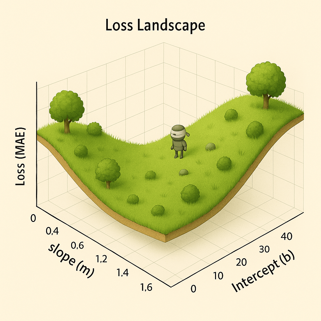
And look! You see that little guy? There’s a robot! We are going to design some instructions for this robot on how to find the bottom of the valley. You will note our robot has his eyes covered, so he can’t just have a look around for it and head that direction.
If we want him to navigate to the bottom of the valley, he’s going to need to use little feelers to work out which directions will take him down. We’ll drop the little guy randomly on the map, get him to stick out two feelers, one for each axis.
Feelers going out … beep beep beep:
feeler m: -5
feeler b: +2
What do these numbers mean? They represent the slope, or gradient, of the hill (our loss function) at the robot’s current position.
-
feeler m: -5 means the ground slopes steeply downwards along the ‘m’ axis. For every step in the positive ‘m’ direction, the robot goes down 5 units.
-
feeler b: +2 means the ground slopes upwards along the ‘b’ axis. For every step in the positive ‘b’ direction, the robot goes up 2 units.
To get to the bottom of the valley as quickly as possible, the robot should take a step in the direction of the steepest descent: a big step in the positive m direction and a smaller step in the negative b direction.
Rinse and repeat and our robot finds himself at the bottom of the valley very quickly: the bottom being the place where the loss is lowest, because the parameters to our prediction function make the best predictions over our dataset!
A Quick Recap
Let’s nail down the core idea one more time. It’s easy to get lost in the different functions, so let’s be explicit about their jobs. If you’ve got it already, amazing, gold-star. ⭐
-
Step 1: The goal is a prediction function. We want a single, specific function that predicts a y value from an x value. For our sitcom example, we plug in the man’s age (x) and get a prediction for the woman’s age (y).
- Example:
y = 0.91x + 1.5is a Prediction Function.
- Example:
-
Step 2: The shape of that line is controlled by its parameters. Our Prediction Function belongs to a family of possible functions (in this case, all straight lines). The specific shape (like how slopey it is, and where it crosses the x axis) of our line is controlled by its parameters: the slope m and the intercept b. By choosing a different m and b, we create a different prediction function. These are the dials we can turn.
-
Step 3: The scorecard is the loss function. How do we know which parameters are best? We need a “scorecard” that rates how good any given pair of parameters is. This is the job of the loss function.
-
The loss function takes the parameters (m and b) as its input.
-
It looks at our entire dataset and calculates a single output number: the total error, or “loss.”
-
A lower loss means a better score, which means we have better parameters.
-
We can get the computer to find this for us by plopping it down on the loss function (the hill above!) and asking it to figure out the gradient where it is, and keeping descending that gradient. This process is called (unimaginatively) gradient descent.
There are a gazillion questions still to answer and details to cover, but the ones we’ll be jumping right into in the next article include:
-
How far should the robot travel in each direction each time?
-
How does this work for prediction functions that are lines?
-
What about functions that take multiple inputs?
-
How does the computer actually work out the gradient?
-
What does any of this have to do with Neural Networks and Large Language Models?
-
What was all that fuss we made about lines being well-behaved and differentiation about?
-
What’s the name of our super cute robot?
And remember: the purpose of all of this kerfuffle is to get the computer to come up with functions that make accurate predictions about sets of data: to find the best-fitting line for a set of data points.
Our whole goal is to find the one pair of parameters (m and b) that produces the lowest possible score from our Loss Function. That winning pair gives us our final, best-fit Prediction Function.